BRIEF
CLIENT
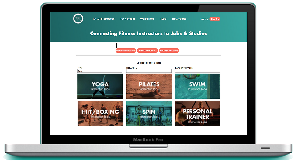
Your Personal Connection (YPC), based in Melbourne, is a job posting website that connects yoga and fitness instructors with gyms and fitness studios.
CHALENGE
Collaborating remotely with YPC who were experiencing a high bounce rate at the point when users were applying for jobs on their website. They also had a problem converting instructors to become registered members.
PROJECT DURATION
TEAM
MAIN ROLE
3 Weeks
3 people
Research
Design Development
Prototyping
RESEARCH
Google Analytic
User Surveys
40 Responses
User Interviews
8 Participants
The Client provided us with an online survey and Google Analytics data to help identify user demographics and online behaviour. This was a good starting point to investigate the issues further.


We began by conducting a website usability test. This was where we discovered major technical issues of the website during the onboarding process.

USER INTERVIEWS & MORE USABILITY TESTING
Interviews were conducted with users and fitness instructors at local fitness studios. We have learned first hand a great deal about the their behaviour, pain points and expectations.
MAJORITY OF USERS SAID THAT THEY LIKE TO APPLY FOR JOBS IN-PERSON AT GYMS/STUDIOS TO SHOW THEIR PERSONALITY
SOME USERS SAID THAT THE WAY TO MOTIVATE THEM TO CREATE A PROFILE WOULD BE TO SEE MORE JOB ADS
LOCATION, TIME, PAY RATES AND TYPE OF SPECIALTY ARE THE MOST IMPORTANT INFO FOR USERS TO SEE IN A JOB AD
SOME USERS FIND JOBS/SUB ROLES ON FACEBOOK GROUPS LIKE YOGA SYDNEY, BECAUSE OF THE IMMEDIATE NOTIFICATIONS
WORD OF MOUTH AND USING THEIR NETWORK OF INDUSTRY CONNECTIONS IS A POPULAR WAY FOR PARTICIPANTS TO FIND NEW JOBS
MAJORITY OF USERS SAID THAT THEY WOULD LIKE TO BE ABLE TO UPLOAD THEIR OWN CV ONTO THE YPC WEBSITE

Unclear navigation label
Fixed sign up box feels like its blocking a content in the back
man users were confused and
thought these were buttons
These testimonials were hard to read.
During the interview, we also conducted usability testing of the current website to get their feedback and ideas that would make the site more aligned with their needs. Their responses validated our findings from earlier usability testing.
-
Homepage looked busy, overwhelmed by the content.
-
Some of the labeling on the main navigation menu were confusing for.
-
After users signed in through Facebook, they get taken to an FAQ page instead of dashboard.
-
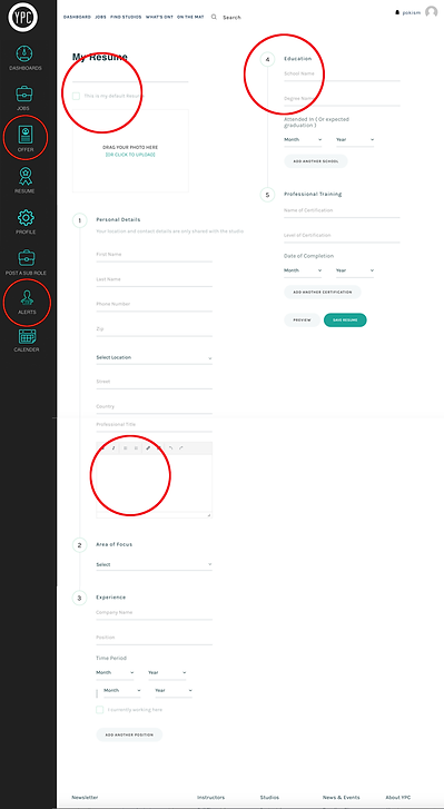
Some part of the Create Resume Section were confusing and made it unappealing to complete the process.
-
The education information in Create Resume section
was irrelvant.
-
The search job button on the Homepage was not easily noticable.
-
Some dashboard menu icons were confusing
-
Many users liked the Instructor job images on the homepage and found them userful.
-
The testimonials were difficult to read
Unlabeled texted field
Unlabeled texted field
Education info is irrelevant
Confusing dashboard menu

PERSONAS & USER JOURNIES
Using the research information we have created two personas which represents the two main users of YPC website. And the User journey was created to look at the emotions is the persona as they are going through the journey on the website
-
Studios and gyms will post more jobs if there are more instructor profiles
-
Instructors will engage with the site more if there are more job posts
-
Many instructors apply for their jobs in person so studios/gyms can see their personality
-
Onboarding process needs to be simple and straight forward
SYNTHESIZING RESEARCH
Compiling our research findings on our project wall, we discovered insights – patterns of information – which would play a vital role in formulating our design solution.


BUSINESS GOALS
-
To convert more visitors to registered clients
-
To create more profiles to view on the website
USERS' GOALS
-
To easily register and create a profile
-
To allow the personality of the instructor to come out in their profile.
After concluding the research we moved on to design stage. Our team generated multiple design options to address the pain points and seize the opportunities discovered during research. The design ideas were narrowed down to MVP using the MSCW framework, identifying the minimum key features required for our solution to solve the most important user pain points.
DESIGN EVOLUTION

THE SOLUTION
LOW FIDELITY PROTOTYPE


Homepage Pop Down sign-up box Dashboard
Profile(Resume) new form design ----------------------------------------------------------------------------->
Job listing page Job Details page
Key Iterations
- Home Page should have a search bar up top like most job search website.
- Job details page should have the same website basic instruction as on Homepage, as this is also a landing page.
- Video Profile Section to offer an alternative for Picture or social Media link.
Video Profile

Job Landing Page

Homepage
FINAL SOLUTION